Please Do Not Feed Metal Sign
The Shock Value of Satire: Deconstructing the "Please Do Not Feed the Whores Drugs" Sign
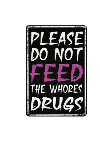
The image presents a digitally rendered representation of a vintage-style metal sign, a deliberately provocative and darkly humorous statement: "PLEASE DO NOT FEED THE WHORES DRUGS." The sign, designed to mimic the appearance of a weathered, distressed metal plate, employs a combination of stark contrasts, bold typography, and a shocking message to elicit a reaction, primarily through its use of satire and shock value.
The Sign's Composition: A Deliberate Clash of Elements
The sign's composition is a deliberate clash of elements, designed to create a visually arresting and unsettling experience. The background is a solid, dark color, likely black or a very dark gray, providing a stark contrast to the white and purple lettering. This high contrast ensures that the text is easily readable from a distance, drawing the viewer's attention to the sign's shocking message.
The text is arranged in a series of lines, each presented in a bold, uppercase font. The use of a simple, unadorned font ensures that the message is conveyed directly and without ambiguity. The phrase "PLEASE DO NOT FEED" is positioned at the top of the sign, establishing a sense of authority and urgency.
The word "FEED" is presented in a larger font, and in a striking purple color, emphasizing the action being prohibited. The subsequent lines, "THE WHORES" and "DRUGS," are presented in white lettering, completing the shocking and provocative message.
The sign's surface is designed to resemble a weathered, distressed metal plate, complete with faux scratches, rust spots, and faded areas. This deliberate attempt to mimic the appearance of an aged object contributes to the sign's vintage aesthetic, suggesting that it has been a witness to countless acts of transgression and dark humor.
The Typography: Bold, Direct, and Confrontational
The sign's typography is bold, direct, and confrontational, reflecting the shocking nature of its message. The use of a bold, sans-serif font ensures that the text is easily readable and immediately comprehensible. The absence of any embellishment or ornamentation emphasizes the sign's direct and straightforward approach.
The varying font sizes and the use of purple lettering for the word "FEED" further emphasize the key elements of the message, drawing the viewer's attention to the shocking action being prohibited.
The Provocative Message: Shock Value and Satire
The sign's central theme, the shocking prohibition of feeding drugs to "whores," is presented in a deliberately provocative and satirical manner. The use of the word "whores" is intended to be offensive and shocking, challenging the viewer's sense of morality and decency.
The sign's message is not intended to be taken literally, but rather as a dark and ironic commentary on societal taboos and the use of shock value to elicit a reaction. The exaggerated prohibition is presented in a way that suggests a playful disregard for conventional notions of politeness and decorum.
The sign's message can be interpreted as a satirical commentary on the human tendency to be both fascinated and repulsed by the transgressive. By presenting a shocking message in a humorous context, the sign invites the viewer to confront their own prejudices and preconceptions.
The Vintage Aesthetic: A Nod to Transgressive Humor
The sign's vintage aesthetic, characterized by its distressed texture, faded colors, and faux rust spots, contributes to its transgressive appeal. This deliberate attempt to mimic the appearance of a weathered, metal plate suggests that the sign has been a witness to countless acts of dark humor and social commentary.
The use of a vintage aesthetic also allows the sign to transcend its specific message, transforming it into a decorative object that evokes a sense of nostalgia for a bygone era. The sign's weathered appearance suggests that it has been a part of numerous moments of transgressive humor and social commentary, adding to its charm and appeal.
Interpretation and Cultural Context
The "PLEASE DO NOT FEED THE WHORES DRUGS" sign can be interpreted in various ways, depending on the viewer's cultural background and personal experiences. For some, it may be seen as a shocking and offensive statement that has no place in polite society. For others, it may be viewed as a satirical commentary on societal taboos and the use of shock value to elicit a reaction.
The sign's message also resonates with the enduring appeal of dark humor, which allows for the exploration of sensitive topics in a humorous and non-threatening manner. By presenting a shocking message in a satirical context, the sign effectively transforms a potentially offensive statement into a source of amusement.
The sign's vintage aesthetic and transgressive appeal also evoke a sense of nostalgia for a bygone era, a time often romanticized as a period of rebellion and social commentary. This nostalgia, however, is not without its complexities. The sign's message, while seemingly apolitical, can also be interpreted as a subtle commentary on contemporary social norms and the pressure to conform.
Conclusion: A Provocative Statement on Shock Value and Satire
In conclusion, the "PLEASE DO NOT FEED THE WHORES DRUGS" sign is a deliberately provocative and darkly humorous statement that employs shock value and satire to elicit a reaction. Its stark contrasts, bold typography, and shocking message all contribute to its appeal as a decorative object that challenges conventional notions of politeness and decorum.
The sign serves as a reminder of the enduring power of dark humor, the ability of art to challenge societal taboos, and the ever-evolving relationship between shock value and satire. It's a testament to the enduring appeal of transgressive humor, the playful questioning of social norms, and the enduring quest for amusement and social commentary in a world often defined by seriousness and caution. The sign, quite literally, prohibits a shocking action, inviting the viewer to confront their own prejudices and preconceptions. It's a sign that speaks to the heart of satire, a reminder that sometimes, the best way to challenge societal norms is to shock and amuse.


